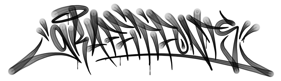
A History of the Graffiti Fonts® Type Foundry
by: Matthew (Raseone) Napolitano - 2008, 2012, 2019
Pages: A History of Modern Graffiti Typefaces, A History of the Graffiti Fonts® Type Foundry, Graffiti Lettering Taxonomy
by: Matthew (Raseone) Napolitano - 2008, 2012, 2019
Pages: A History of Modern Graffiti Typefaces, A History of the Graffiti Fonts® Type Foundry, Graffiti Lettering Taxonomy
The official Graffiti Fonts collection was founded in 1999 by Bay Area writer "Rase One". The font foundry is one of many brands & businesses that sprung from the San Francisco bay area "Full Time Artists" (FTA) crew based primarily in San Jose California. The following is the first-hand account from Rase detailing how the foundry came to be. It draws on older writing, interviews, quotes etc. from the foundry's history.
I was about 19 when I first started toying around at designing fonts. I was about 21 when I first got serious about it & started actually using & releasing them commercially. By then I had been running a tiny music label & multimedia business known as Highground Industries since early 1997. Having been a writing since about 1988-89 I tended to inject a graffiti aesthetic into a lot of the design projects I worked on. I started as a designer in my early teens. Tape and CD covers, fliers, logos, sites, pretty much whatever anyone needed I would try to help out. Throuout the 90's the south bay area had a small and somewhat difuse underground Hip-Hop scene. Commercial rap & a gangsterish form of Hip-Hop were the primary youth culture at the time. The more traditional, four elements variety of Hip-Hop culture had transitioned from being often referred to as "old school" & being somewhat frozen in time to being known mainly as "underground" & moving in a more cerbral & artistically complex direction that was largely not compelling to the "mainstream" crowd.
The writers, emcees & Hip-Hop DJs, breakers & dedicated Hip-Hop heads that carried on this sub-culture were a small and dedicated community that stretched all throughout the bay area & far beyond. By the mid 90's, 30ish years after the definitive birth of Hip-Hop culture, in the era of grunge rock & chronic clouded cyphers this small "Underground Hip-Hop" community thrived via connections to the rest of the bay, LA, the midwest, east coast & numerous local bubbles around the globe in a mostly pre-internet world. Most households were not on the internet, at least not much. These artist were doing something that was not terribly cool, popular or well understood at the time. The people of whom this scene was built were of all races, ages, backgrounds, economic status & belief systems. The sense of community was strong. These people came together to preserve & develop what they saw as their lifestyle, their culture. It seemed to them like a dying art, maybe even a lost one. There was a feeling of reclaiming the culture & its crafts for the common man, for positive & constructive use. There was a general feeling that the various disciplines in Hip-Hop were still largely undervalued & underappreciated, seen as simplistic & childish. There was a certainty that despite the huge heights already reached, particularly by Rap music that tings could go much, much further.
In this environment a small fairly established crew like FTA (founded in 1991) found themselves less alone in the world. After coming together from all around the bay these dozen or so individuals were now linked in to thousands of other artist like them. Graffiti had not died, Hip-Hop was not over with, Hardcore mentality, sexuality & materialism (as much fun as they are) were not all the bay area scene or Hip Hop in general had to offer. It seemed necessary at the time to support & promote this belief. In fact, all throughout the nineties these pockets of "Underground Hip-Hop" had been developing everywhere & by 1999 it had already become cliche & pedestrian to even use the term "underground" to describe the huge genre of emerging artists. The term "Independent", as used in other genres like rock had become more fasionable. We had perhaps become too numerous for our own good. In a time and place like this an obscure animal such as a "Graffiti Font" seemed like a natural development. It was in fact very strange to me that, apparently none yet existed. Most writers eventually end up doing alphabets or style guides in some form for practice or for an initiate or someone to whom they wanted to pass a personal or traditional style on to. Computers were now in most every home & the so recently non-existent internet was now officially everywhere. A healthy amount of digital & even vector based graffiti art was being produced. Why were there no graffiti fonts? People were definitely looking but there was seeminly nothing to be found.
Technically, by 1999 there were actually 3 or 4 "Graffiti Fonts" in existence. One of them, the 1st in fact, entitled "Graffpity", was developed by well known writer Crayone from the SF bay. More about Graffpity in our article "A History of Graffiti Typefaces". Hardly anyone at the time could find any of them but they were out there. By 2000 there were at least 5-8 depending on what counts as published. I had developed & published 3 complete graffiti typefaces during 98-99. At the time I was under the belief that there was no such thing & mine were the first & only. I had undertaken the creation of a full CDROM set of graffiti style fonts & a corresponding website but was conflicted on the aspect of commercialization. In addition to this, the implications of allowing ones own graffiti style escape their personal control as a digital typeface would seemed potentially problematic in any number of ways.
Given these concerns and given the consuming struggle to make a living dubbing tapes & CDRs, providing graphics for small streetwear brands, building web sites for small businesses etc. to see the immediate potential for the Graffiti Fonts project I let it sit somewhat useless in a pile of other assets like vector illustrations, web templates, stock images and such, slowing expanding and improving the initial 3 font families: Raseone®, Human Rase™ & New Digital™ & prototyping several more including Pilot Rase™, FatCap™, RapScript™ and others but only publishing or utilizing the resulting digital typefaces in a very limited capacity. By 2001 Rase had missed the chance to register the graffitifonts.com domain name and a spammy site had sprung up with free graffiti-ish fonts saturated in banner ads. For me this both dampened the idea such a collection & further drove the desire to counteract the exploitive tendencies of commercialism & reclaim this territory for those who better understood the true depth and breadth of graffiti lettering and thus for those targeted by its presence in commercial material & mainstream culture.
One particular day, soon after sept 11th 2001 enough was enough and development of a viable CDROM & website to bring the Official Graffiti Fonts® collection to the world was untertaken. The first widely available, commercial product, our GF1 collection was based, first at fulltimeartists.com, then soon after it found a dedicated home at graffitifonts.net. During 2000-2002 another two noted individuals also had produced small sets of tag & throwie style fonts. By the day in early 2003 when the official Graffiti Fonts™ collection officially debuted commercially it had come to adopt almost every graffiti style font ever produced (a whopping total of 13). I had chosen to include only fonts that were specifically made with the intention of representing "real" graffiti art & to omit the many fonts often used to immitate graffiti. Only 3 of the fonts that I initially built were included as I had chosen to set a fairly high bar for character sets & functionality. I was also still very apprehensive about productizing such things. Response to the original Graffiti Fonts 1.0 CDROM collection was immediate & surprisingly positive. With no promotion what-so-ever the first official copy sold within 5 minutes of release on graffitifonts.net. In a 2008 interview I described my original outlook as follows: "Our first fonts were so irregular and ridiculous, I never thought any commercial designers would want them... I figured every real graffiti writer would just make fun of them". This was a probably a valid concern. So called "Street Cred" for a graffiti artist does not come easy and, like most notoriety can be very fragile. Though I, my crew FTA & the official business entity Highground™ under which I operated had some notoriety springing largely though the worldwide underground music scene and the local graffiti scene there was not significant name recognition or "Fame" to catapult such a collection to wide recognition. The collection would have to succeed strictly on its own merits.
The worlds of commercial art ∓ design had dipped their toes into graffiti art many times over the decades. There was a strong resistance & scrutiny among writers & other cultural devotees of any commercial application of graffiti art. Independent & mainstream products such as printed clothing, packaging, marketing materials, usage in film, games & branding that came from these trends were often viciously criticized as being cheesy & exploitive. Through all of this however there was an element of validation and momentum & a steady breaking down of barriers & pre-conceived notions. Part of the "problem" was that far too often when the graffiti motif was used in mainstream art an design it was false, inauthentic, reductive. It was often terribly obvious that the designer had no idea what real graffiti art was all about and thus that the company behind such work seemed interested only in shallow attempts to exploit the culture. It would have been an easy gesture to hire an actual graffiti artist to provide something more authentic.
With somewhat unexpected, initial support from the underground community and an encouragingly strong start online the Graffiti Fonts® collection went into more agressive development & production. "I was afraid of Adobe & Monotype, websites & software companies scared me... I figured as soon as anyone noticed that people would actually buy these things I would be immediately have my thunder stolen by some big company with more resources." The foundry was very small & I had already learned a painful lesson when the .com was taken due to my apprehension.
By the end of 2004 few font websites had started to include categories for graffiti. The obscure fonts that had taken so much research to dig up out of the corners of the world had been collected & published, linked to & credited, utilized or otherwise mentioned in the context of the Graffiti Fonts® collection. While were not the only onse to aggregate some of these fonts, this made easy pickings for ad supported aggregator websites. The water had gotten a little muddy but the official Graffiti Fonts collection was still the most serious effort in this area of design. A nearly immediate advancement to Graffiti Fonts 2.0 would bring in the now completed versions of my other early fonts and would widen the margin enough that it clearly offered more in this underserved area than the rest of the collective world. With over 30 graff style fonts covering the basic taxonomic types of graffiti lettering the 2nd collection was a strong commercial graphic asset still true to it's underground roots. www.graffitifonts.net now had thousands of visitors each day & thousands more visited fulltimeartists.com to see the fonts and other art/design from the FTA crew. Uncontrollable bootlegging immediately set in with the release of each collection but the foundry got enough attention to keep it viable. The .net site was now giving the .com a run for its money. Google was the only search engine that mattered anymore. The .com was permanently stuck to #1 in the search results, we got ahold of position #2 & held it.
Work never stopped and by 2005 there was already a 3rd CDROM collection. 60+ fonts, custom software, stock images & art. The CD was full to capacity with goodies. I finally felt like I had it right with the 3.0 collection. GF3 combined the fonts, with custom & open source software, stock images, art & sample files in a more advanced manner that could truly "enable the unable" to a greater degree than the first 2 collections. "The real value is all in the fonts, that determines the price. Everything else on the CD is basically free. I want to provide value, earn my own money, but I want to help people out as much as I can. I love open source software, the whole concept of it." Open source apps were something most people had never heard of. Adding these apps made the collection a real, stand-alone product.
In describing discussing the system of layering multiple fonts together to emulate a basic graffiti piece with outlines, fills, 3D & details Rase said " The book gives you the visual cues that show you the basic process. Forget specific software, think plain logic…You can do this with almost any application." This seemingly obvious layering concept, so common today was virtually unheard of in 1999-2000 when it was built in to early graffiti fonts such as Def Artist & Raseone. In combining the font collection with an array of applications that could accommodate this process in vector, bitmap & 3D graphic environments and packing in templates, vector art, stock images and functional, open source fonts I was attempting to create a both a viable product for a high-end designer and a singular and self sustained solution for the uninitiated customer with no particular design skills or technology. The GF3 collection was again well received and again heavily pirated. The foundry's graffitifonts.net could still not overtake the .com site in Google search. "That top slot was the crown. Winning that battle without completely selling out would be something special."
During the 2005 - 2009 era graffiti would finally get the wide-spread recognition that it deserved in type & typography. While handmade graffiti lettering and the entire graffiti motif had been prominent in commercial design, the seaming impossibility (and lack of financial reward) of capturing these organic forms in mechanical type had created an extreme lag the development of typefaces representing this decades old, highly developed art form that treated lettering like a religion. The Graffiti Fonts® foundry was working to play catch up, to lay the missing foundations to push back the limitations and scale the cliffs that had kept the cultural phenomenon of graffiti from broader inclusion in the history of type & lettering.
The 4th edition of the Graffiti Fonts® collection was released in mid 2009. The 4 year project was different than the previous 3. There were now several other font authors who had published serious efforts in handstyles & throws and who had the cultural awareness to pull it off. With the genre growing GF4 would be the last collection that even attempted to include all of the worlds graffiti style fonts. By this point there were dozens of viable and valuable graffiti style fonts that could not be included due financial & licensing issues.
GF4 was different. Unlike the previous 3 iterations it did not include the cumulative content of the previous collections. It was a fresh start. it would be 50 all new graffiti fonts by Rase (with some help from FTA cronies) & 50 all new free graffiti & hip hop centric fonts from various developers. GF4 would expand on the theme of robust context by including an array of 100 fonts, 100 vector paint splatters, 100 vector skylines, 100 graffiti themed vector clips, 100 Hip-Hop/graffiti centric photo cutouts, 100 stock images, templates & the open source software suite. CD/DVDROMs were dying. The very idea of such a collection would struggle in an on-demand world where everything is free even when it's not. While "keeping it real" may have kept the foundry from entirely conquering Google algorithms it had not kept it from winning the game in some ways. With money earned by the success of the earlier GF3 collection the foundry was able to buy out the Google-blessed graffitifonts.com domain name for $52k. With about 100 exclusive graffiti style typefaces (still more than the rest of the collective world), the .com domain name and a decade long history as the worlds only graffiti-centric type foundry and as the authors of the worlds only large-scale collections of modern graffiti style typefaces the foundry had come a long way since 1999 and arguably had done a lot of the heavy lifting in opening up the entire genre.
Starting in 2011 the internet underwent some deeply impact-full upheaval. These fundamental changes created a chain reaction for many content creators & owners, for some entire industries and niche markets & for small businesses in particular. This set the foundries development in an altered direction. In the years since 2012 the foundry has worked towards the development of more sophisticated and expansive graffiti type families & sets. "Given enough time we can emulate and even create much deeper levels of style & concept… We can truly do justice the sophistication within the craft". With credits from the depths of the underground to the heights of commercial design the Graffiti Fonts® type foundry is now working to solve "larger problems "with "more powerful theory". "Anyone who breaks ground once should keep trying to do it again."
In 1999 the Graffiti Fonts® type foundry was first conceived around the notion that the only way to define a graffiti genre in type was by the intention of the author. With infinite styles & mediums present in graffiti lettering the only objective factor is whether or not the author intended the font to represent or incorporate elements of modern graffiti art. Beyond that things quickly become subjective & complex. Questions of authenticity, quality, style, usability etc. while important can't really be used to separate graffiti from other styles. An advanced handstyle or wildstyle font is no more valid or authentic than a primitive, toy tag style. A font of poor technical quality or limited capabilities is no less valid than a more serious effort in this context. Certainly some of the most "authentic" graffiti styles would have to be those of the earliest founders of the art. Those styles are mostly primitive by modern standards but definitely very "real". Similarly, the earliest graffiti fonts were somewhat remedial in thier execution from a type developer / typographic standpoint.
Arguably, if an artist illegally spray painted letters onto a wall in a faithful implementation of Garamond or Helvetica this would be Graffiti. Were it legal it may be a mural or a commercial sign. So… what if a graffiti artist (writer) paints Helvetica into a legal mural that doubles as a commercial sign? Is it Graffiti? What if the artist is not a writer? What if there are no letters at all? Is it graffiti then? Certainly the use of spray paint might be a clue but not an absolute determining factor. The styles themselves are so incredibly diverse that they defy definition so this of course applies to typefaces as well. Some things are very obviously graffiti, some things are less easy to categorize. Clearly, there is science in art & art in science & no hard line between the two.
I worked under the theory that In reality graffiti lettering is not separate from other styles at all. Instead graffiti encompasses, includes, influences & is influenced by all forms of lettering & type. While no one can draw a hard boundary to confine graffiti lettering, fonts, typography or writing I had the opportunity in building this foundry to help define Graffiti Fonts® as fonts created with the intention to emulate modern graffiti writing & lettering in all its forms & to focus on the more uniques aspects of the motif. My hope is really just to make a contribution. I want to validate & preserve graffiti traditions in type but most of all to innovate & expand the art form, to add to it & push it to new places.
While I was not the first, for years my foundry had been practiaclly the sole producer of serious efforts in this area & one of only a handful to ever attempt it. We operated for several years before an appreciable number graffiti style fonts had been authored. At the time of the latest update to this article (2019) we've still designed more such fonts than the rest of the collective world combined but this can't last forever. While my earlier work focused largely on covering the bases & laying foundations my currents efforts center more around the sophistication required to really do a style justice.
For more information on the specific history of our foundry please see our full article covering the History of the Graffiti Fonts Type Foundry.