A History of Modern Graffiti Typefaces - Part 3 of 6
by: Raseone Updated 04/17/2024
The First Graffiti Fonts
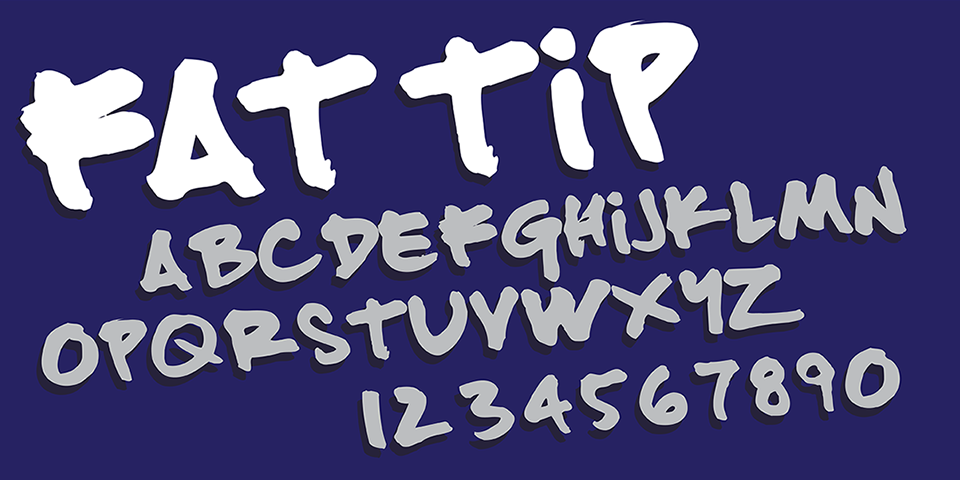
Fat Tip - Turntable Media (1996) font specimen.
Fat Tip - The First Real Graffiti Font
If the main critera in defining a Graffiti genre within type is intention then the first typeface in this genre has to be "Fat Tip". The Fat Tip font was created in mid 1996 by Turntable Media. A "Fat Tip", also, often called a "Fat Cap" is any spray can cap (actuator) that creates a wide, circular spray pattern. A type of actuator known as the "New York Fat" has remained the most popular Fatcap since the early days of graffiti but there are many, many varieties the first of which were found & repurposed from other household products like "Spray N Wash", oven cleaners, shoe polish. Smart graffiti artists found the source of these caps and began to buy them in bulk for use with spray paint. The Fat Tip font is not exactly a tag style but is meant to emulate the look of letters written with spray paint, using a "Fat Tip". While too simple to really count as a tag or handstyle the graffiti / Hip-Hop influence on the letter style is unmistakable. Around the time of this font's creation the creators at the small, San Francisco based Turntable Media were providing design work for a number of underground & industry Hip-Hop names like Dr. Octogon & DJ Q-Bert, further solidifying the intent apparent in this font to represent modern graffiti in type. This font features the same array of characters for both capital & lowercase as well as numbers & most of the standard punctuation & symbols. Like many of the early graffiti style fonts, Fat Tip was never supposed to be distributed by anyone other than its creators but rampant piracy has spread it to a multitude of font download websites over the years.
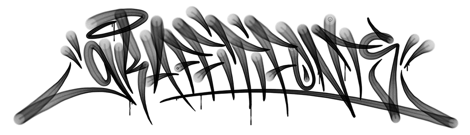
Graffpity - font specimen - Crayone (1999)
The first digital font to convey a genuine graffiti handstyle & the first authored by an actual writer.
Graffpity - The First Handstyle (tag) Font
The first digital typeface to authentically represent a real graffiti "handstyle" or "tag" was a font named "Graffpity" cut by prominent & very talented SF bay area writer Rigel (Crayone) Juratovac. Graffpity was in fact the first digital typeface designed by an actual writer. Crayone was featured in the highly influential book "Spraycan Art" & later a number of videos, magazines & other media. Having painted some iconic & long-standing murals Crayone was already well known by writers far & wide but especially so in the west coast, bay area scene.
Also an accomplished graphic artist, Crayone was amongst the earliest crop of dedicated graffiti artists to add digital, and specifically vector art to his toolkit. While many graffiti artists have moved into the commercial art world, it was not until the 1990s that we started to see many retaining the label of "graffiti artist" or "writer" as a primary identity into their professional careers. Crayone was certainly one of the earliest, "professional" graffiti artists of prominence in the digital space as well as being one of the earliest to have an independent presence on the web. This font is one of many pioneering contributions from Crayone. The GraffPity font is included in the official Graffiti Fonts® collection & can be downloaded for free in our Free Graffiti Fonts section.
Graffpity was designed & published in 1998 but the font was very obscure in the grand scheme of things. In fact, despite extensive searching & methodical research the Graffiti Fonts® foundry didn't even discover this font until we were working on our 3rd collection in 2004. It was reasonable at the time for us to incorporate virtually every graffiti font ever created into our collections but we had managed to miss both Graffpity & Fat Tip in our fisrt 2 collections (2002-2004). The Graffpity font had resurfaced from obscurity due to an increasing volume of interest in graffiti style fonts but specifically due to piracy. The font was added to the 3rd edition of the Graffiti Fonts® collection in 2005. This required some simple technical fixes (the original font required one to type in all caps). Correcting the earlier oversight we added it retroactively to the original editions as well. This left only a couple of the worlds first graffiti-style fonts not included in the collections.
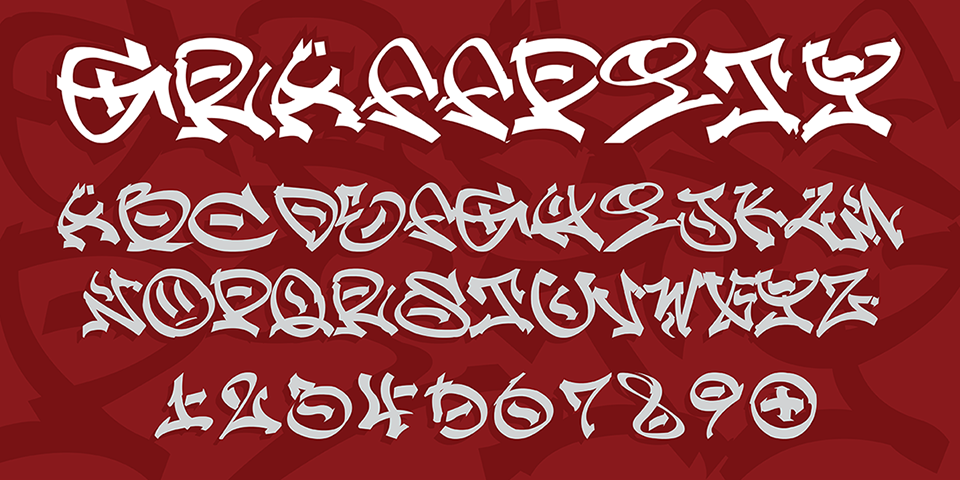
RaseOne Font Family - font specimen - RaseOne (2000)
The first "wildstyle" graffiti fonts & the first layered type sytem in the graffiti genre.
RaseOne - The First Wildstyle Graffiti Font
While the first couple of typefaces to appear in the graffiti genre represented written forms like tags, it wasn't long before the other major elements of graffiti lettering began to make the scene. With only a handful of designers having ever attempted the somewhat self-contradicting concept of a graffiti font, font families like RaseOne entered the world of digital type in the last moments of the 20th century.
In the formative days of real-world graffiti art, in the early 1970's, moving beyond these written forms, early writers began to thicken and outline their tags, add backgrounds & inner detail elements. Over time this practice melded with the regional arrays of block & bubble letter styles in the graffiti toolkit to form what writers usually refer to as "pieces" (short for masterpiece). A "piece" could be described most simply as graffiti lettering that is drawn rather than written, more elaborate than the simpler drawn block & bubble forms of throw ups. While modern 3D realist styles challenge this definition, a piece would usually include an outline & often a dynamic, multi-colored inner fill. The point where traditional legibility or "sight reading" begins to be challenged is a descent place to draw a line between pieces from simpler drawn forms like blocks & throws. "Wildstyle" is the name given to the more abstract & elaborate form of pieces that first emerged in the New York subway art era of the mid 1970s. There is no particular stylization that defines a wildstyle. It's more a simple matter of complexity & abstraction. Before long, the wildstyle piece was a primary element of graffiti art and the driving force behind the work that gained graffiti art its current, massive, worldwide following and legitimacy in the world of art.
Many years later, in 1999, the RaseOne font family was the first digital typeface designed to build wildstyle pieces. The lettering itself represents a wildstyle configuration unique to the artist but this font also included other necessarry elements like alternate letters, arrows, embelishments & flourishes, especially for the begininng & end of each piece. Critically this font family was built with a layering system for implementing the characteristic components of any traditional piece: a fill, an outline, inner details & 3D. With about 260 glyphs in each of the 4 layers Raseone was for many years the most elaborate graffiti font out there. The RaseOne font family is part of the official Graffiti Fonts® collection and is featured in our Graffiti Fonts section.
This layering system would however prove not to be as unique as I (the author) had initially believed. This concept of fill, outline, detail & 3d is so fundamental to the structure of pieces & wildstyles that another writer (turned type developer) named Chuck Davis, had independently followed this same intuition within the year, developing a graffiti font set that had two styles called Def Artist & Def Writer. He had, in fact developed non-graffiti, layered fonts utilizing this same concept years earlier, with an entirely different motivation but his early graffiti style fonts were a notable contribution to the emerging genre of type.
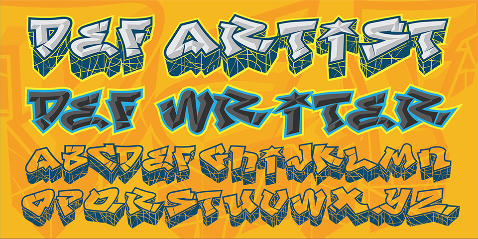
Def Artist / Def Writer - font specimen - Chuck Davis, Letterhead Fonts (2000)
One of the earliest graffiti fonts ever designed, created by the inventor of the layered type system.
Def Artist - From the Inventor of the Layered type System
Another notable first in the graffiti genre and indeed in the broader world of digital type was the emergence of these first layered graffiti type sets. When I first designed the Raseone font family, I thought it was the only layered type family on the earth. Deeper research conducted during the develpment of our 3rd collection in 2004 would prove me wrong. While RaseOne was the first layered type set in the graffiti genre, it was not the first layered set ever created.
Another layered graffiti font would follow only months behind Raseone with a set of 4 graffiti typefaces including two layers for each of two styles: "Def Artist" & "Def Writer". Created in the year 2000 by Chuck Davis of Letterhead Fonts (dope foundry name), the style of this family was somewhere in between a throwie & a simple piece. The family, published in August of 2000, had what at the time was a rare if not unique characteristic. It was one of the earliest examples of what is now known commonly as a "layered Type System". This concept may be one of the first major, mechanical contributions to digital type provided by graffiti writers. The Def Artist / Def Writer fonts included a beveled fill variant that layered precisely over the main outline/3D styles creating a ready-made, beveled fill effect. Def artist was not his first layered or, as he phrased it, "stackable" font set. Specifically it was his third. His earlier stackable sets decidedly predate the layered Raseone family by about a year. I've yet to find an earlier example of a layered type system than Those authored by Chuck Davis. Research continues & this article is a living document but for the moment my research shows Chuck Davis of Letterhead Fonts to be the inventor of the Layered Type System that has since become a staple of advanced digital type.