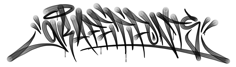
A History of Modern Graffiti Typefaces - Part 5 of 6
by: Raseone - Updated 04/17/2024
5.) Contributions & Innovations in Typography
Of course, the most significant contribution that graffiti had made to type is the already vast & ultimately infinite wealth of new & innovative lettering styles. Graffiti however has also brought a number of more specific & more technical contributions to the table. By nature, the already mature art of graffiti lettering helped bring an abundance of new & seldom used concepts to the forefront of type design. In it's highly organic & ever changing forms, graffiti lettering is certainly among the most challenging categories of lettering to translate into type. Perhaps due in part to this inherent difficulty, the translation of graffiti lettering into type has resulted in notable innovations right from the start.
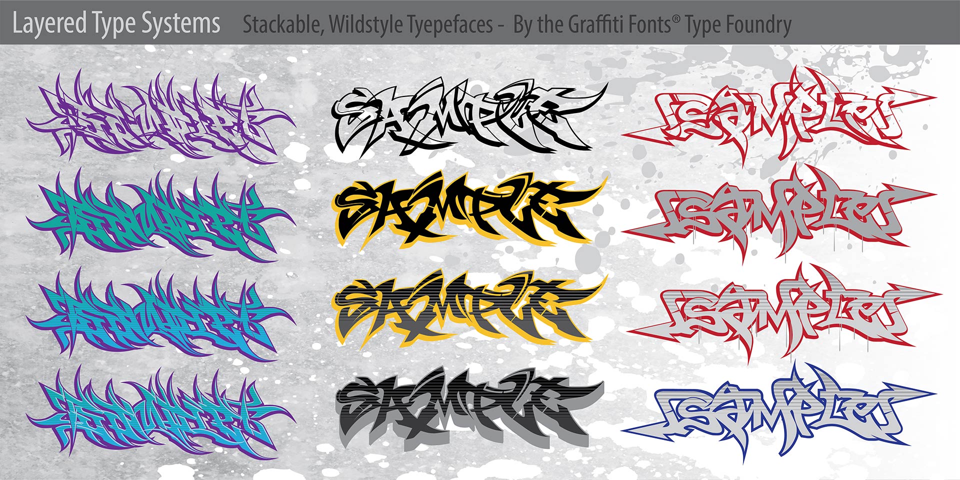
The modern layered type system was invented by a graffiti writer & most of the first layered fonts were graffiti styles.
Layered Type Systems
Some of the very first graffiti style fonts were also some of the very first "layered type systems". The inventor of the layered or "stackable" type system was a graffiti writer and as outlined in earlier sections of this article, also one of the earliest contibutors to the graffiti genre of type. For a substantial period circa 2000-2005 there were likely more layered type systems within the graffiti genre than in all other categories combined. Such symbiotic & complimentary sets of fonts, a concept dissmissed by it's inventor as "nothing ingenious really" are now one of the biggest trends in modern type design. These layered type sets were the predecessors to the modern, color SVG fonts we see today. Aside from the obvious, enhanced detail & time-saving aspects of a layered system vs. a single flat font, the layered systems can in many cases be preferable even to pre-colored SVG fonts. A layered type system places each component style on the same level in the stacking order while glyphs in a color SVG font are each stacked individually with the last letter on top. For fonts with overlapping elements this will result in a very different effect. While color fonts can provide amazing, pre-made treatments & can be broken apart into their constituent parts for customization, many graphic designers prefer the more absolute control & fundamental nature of the layered systems.

The new , full color, vector SVG capabilites of the OpenType format provide exiting opportunities that are especially useful for fonts in the graffiti genre.
Full Color Fonts & Formats
Not coincidentally, an early attempt at inventing a color, vector font format based on this stacking premise was undertaken by the Graffiti Fonts® foundry circa 2004. The concept of combining capabilities of the EPS or SVG & OpenType formats was very similar to the popular implementation we see today but at that the time would have required plug-ins to be developed for compatibility with each, individual application. The general path is obvious enough that it was bound to happen eventually. Ultimately, facing questions of compatibility & scope, the small foundry lacked the reach & resources to pull this off but for a time, a new, full color, layered fomat with a .gf (graffiti font) extension was thought to be the ultimate destiny of the foundry. While this would have been a perfect contribution for graffiti artists to bring to type technology & while they partially did, full execution of this technology was not in the cards. Multiple vector & bitmap implementations for color fonts were introduced by Apple, Microsoft & others but the most robust & preffered solution, adding SVG to the OpenType specification was introduced by Mozilla & Adobe in 2013. This layered implementation most closely resembles the system approximated by the pioneers of layered type systems & provides far more utility than any bitmap implementation ever could. Color fonts are still comparatively rare & many of them are either graffiti fonts or similar fonts meant to emulate natural brush or marker strokes.

The graffiti genre of typefaces broke new ground in the area of fine detail. Computationally demanding fonts can wreak havoc in the wrong context but prove valuable for headline & display.
Texture & Fine Detail
Some of the first graffiti style fonts were also some of the earliest distressed, grunge & other highly textured fonts to emulate aging, damage, brush strokes and other effects in great detail. Such detail can require massive numbers of vector paths which was cumbersome or even prohibitive on older, slower computer systems. While inadvisable in many ways, graffiti fonts like PaintCans which emerged in 2004 or the later Fresh Paint & scraper fonts pushed the limits with hundered or even thousands of paths per glyph. These fonts would easily choke most systems even today if used in the wrong context but they served to prove that this was possible & had it's place. Today we see hundreds of fonts with comprable, high levels of detail. These pre-made effects are often used to emulate brush & marker strokes, aging & damage or textured effects like you might see from stenciled or stamped lettering, lettering applied to a rough surface or even retro printing & hand painting techniques. These fonts can often be over ten times the file size of more traditional fonts & pose a serious challenge with live effects like drop shadows, inner & outer glows or with live, vector animation like Flash. The fine detail is mostly useless at sizes les than about 36 points & the computational demand makes it a very bad idea to use these styles for body copy, but such fonts have become very popular for use in headline & display contexts.
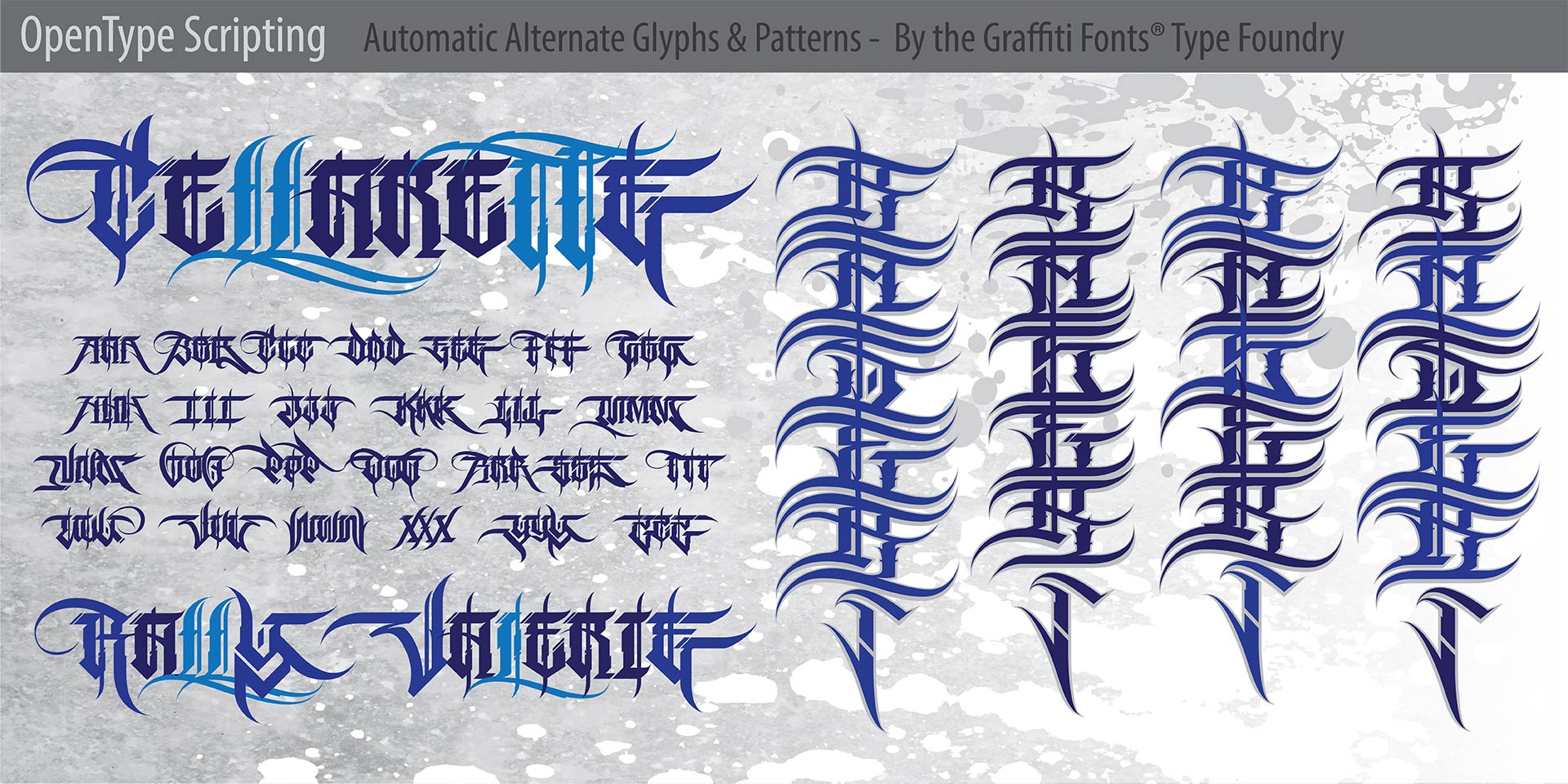
The advanced capabilities of OpenType scripting make it possible to provide dynamic variation of glyphs on the fly creating much more versatile fonts with a more organic feel..
OpenType Scripting
As advanced OpenType scripting (first introduced by Microsoft & Adobe in 1996) gained popularity & support graffiti style fonts were fairly early adopters. Mechanical type could never fully reproduce the infinite variability of hand written or hand drawn lettering but graffiti styles are particularly difficult to systemize. While a definite degree of standardization does exist within graffiti lettering in the form of traditional or regional styles & the passing of styles from one writer to the next though mentorship or imitation, there are arguably a larger number of established, defineable styles within graffiti than within the rest of traditional lettering combined. Each of these innumerable styles introduces it's own traits & solutions. Often these traits defy more traditional issues of kerning, initial & terminal characters, ligatures & alternate characters, issues often accommodated with OpenType scripting. Variances in glyph size, lean, placement, flourishes, swashes, location & nature of connections and other issues can make organic graffiti very difficult to emulate in type. Even so, OpenType scripting can go a long way towards doing a graffiti style justice in this regard.

Many fonts from the Graffiti Fonts® foundry utilize the character slots accessed via the option/alt keys to provide alternate glyphs, flourishes, dingbats & other items useful in the context of creating wildstyles, tags, throws etc.
Breaking the Rules
Certainly fonts with extreme numbers of paths, innovative layering systems, unique, abstract glyph designs & stylization & the creation of a whole new category in type would count as significant contributions to the art form. These innovations required stretching & breaking some rules. In the process a lot of lesser rules were also broken. A characteristic, somewhat unique to typefaces from the Graffiti Fonts® foundry entailed utilizing the standard 256 characters in basic, unicode latin support in non traditional ways. With 94 of the most commonly used characters visible on the keyboard & a few dozen other fairly common characters available via keystroke combinations, this leaves about 100 slots containing characters that are seldom used for most english speaking people. Many of the early Graffiti Fonts used the character slots accessable via the "option" (mac) or "alt" (Windows) key to access alternate letters & other glyphs. Many applications do not support or provide only limited support for OpenType features. Many Graffiti Fonts® typefaces made alternate glyphs available by simply holding option or alt & typing a given character. While paired characters like parenthesis or brackets might be useless in the context of a wildstyle graffiti font, those slots were a perfect place to put initial & terminal flourishes like arrows & other embelishments to help the user build realistic pieces.
Early online text generators, early collections of open source typefaces and countless font download web sites have all benefited from the extensive use of & distribution of early graffiti style fonts. Even in their relative infancy graffiti fonts have established a tradition of contributing to and utilizing bleeding-edge innovation in type & in digital design in general.
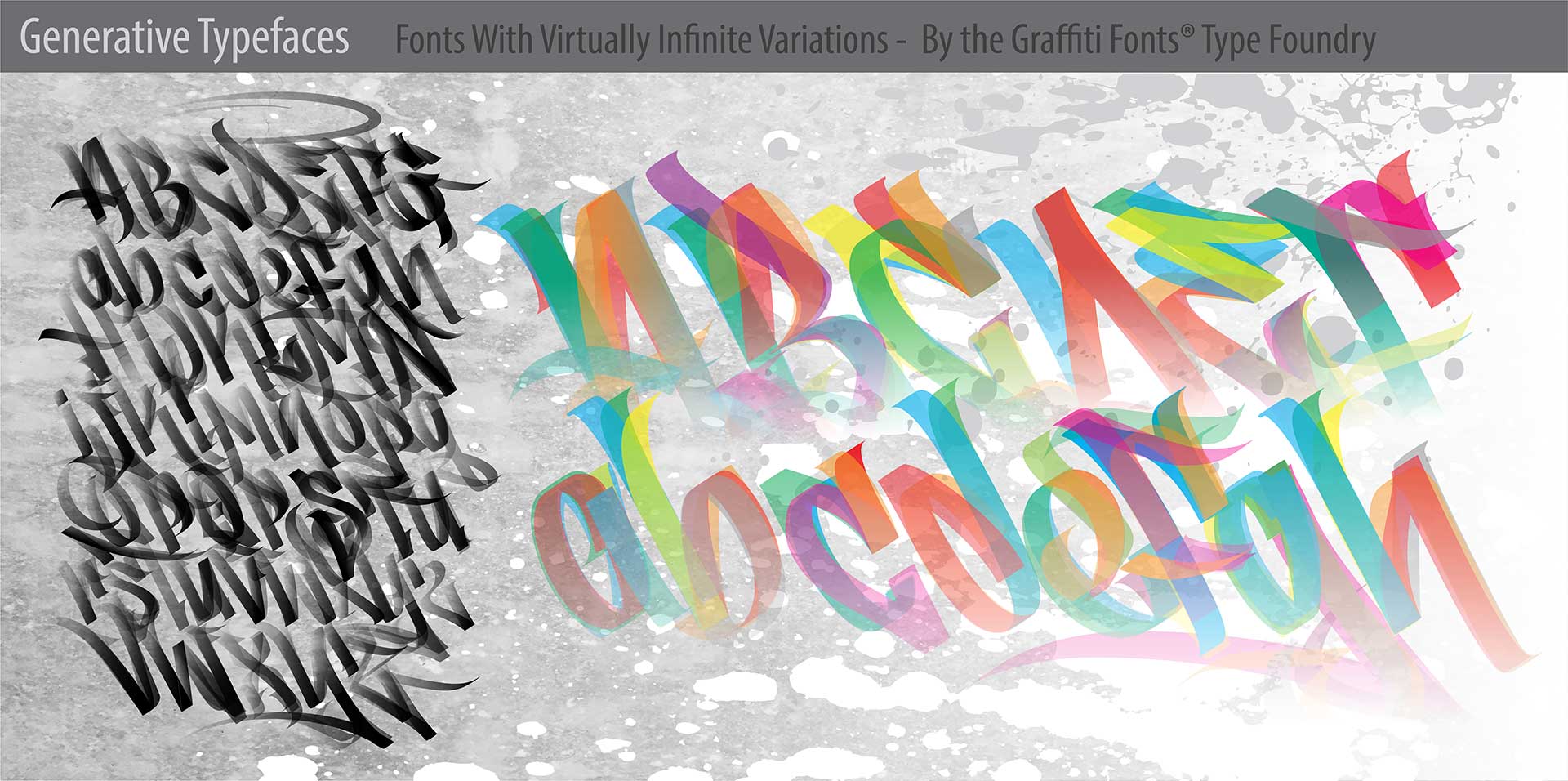
The Graffiti Fonts® type foundry helped to pioneer the emerging category of "generative" typefaces. The generative ManyStyles™ handstyle font has a virtually infinite character set and was the 2nd generative font ever published.
Generative Fonts
In November of 2023, Graffiti Fonts® designer RaseOne released his ManyStyles™ generative, handstyle typeface. ManyStyles™ was the first “generative” graffiti font ever developed and only the 2nd generative font of any sort ever to be published. As part of a wider set of several generative type families, ManyStyles™ was chosen to be completed and released first, specifically to ensure that one of the first generative fonts to make the scene would be a graffiti style font. This new breed of font functions within the existing OpenType specification and is fully compatible with current OpenType (.otf) and TrueType (.ttf) formats.
The techniques that lead to the development of the ManyStyles™ font (and all of our generative fonts) were the result of explorations into the design of wildstyle and handstyle typefaces with massive numbers of variant glyphs. Contextual & discretionary OpenType substitutions allow for the development of complex systems which can capture and emulate many of the organic characteristics that constitute what graffiti writers would simply call a “style”. Generative fonts can exponentially increase the possible variations to virtually infinite numbers. While this can be applied to any style of type, it is particularly powerful in the context of graffiti with its heavily abstracted letter forms.
Whether considering written “handstyles” or drawn lettering like “wildstyles” & “throws”, the lettering styles that graffiti writers develop are often very serious undertakings. Writers will develop and refine styles over the course of years, sometimes decades. Each style has a life of it’s own. Like a species of plant, there is a certain DNA within it, a theory behind it that makes it what it is. While often born in the stylization of a single word or name, this theory develops to a point that it can be applied to any lettering. Only the writer behind the style can really do this. The theory itself is often unspoken, undefined. It is demonstrated but seldom explained. Through the teaching and biting of these styles, the theory passes to other writers and pools into recurring, traditional motifs that collectively make up the core traditions of the art form.
Developing typefaces from these styles allows us to encapsulate a portion of that theory in mechanical type. This preserves the theory and allows us to put some of that ability into the hands of anyone with a computer. Generative fonts vastly expand the amount of that theory that we can capture and implement.