A History of Modern Graffiti Typefaces - Part 4 of 6
by: Raseone - Updated 04/17/2024
Complete Timeline for the Emergence of Graffiti Fonts.
This timeline outlines the emergence of the worlds first graffiti style typefaces as well as the font collections, websites & software applications critical to the beginings of this entirely new category of typography. Nearly a quarter century passed between the time graffiti lettering entered popular culture & the time it entered the world of type.
The Prehistory - 1995 - 1998
While graffiti art & lettering itself had long-since reached a point of tremendous sophistication, the first typefaces to emerge in this genre were fairly primative, both stylistically & technically. Mirroring the early development of graffiti itself, there is a period in the emergence of graffiti style typeface, sort of a prehistory, in which this new presence was entering the scene but had yet to find it's legs. During this period, the first handful of graffiti style fonts seem to unconciously replay the days of the late 60's & early 70's before modern tags, throws & wildstyles. With visual characteristics of street graffiti & an intent to emulate this modern art form these prehistoric graffiti typefaces begin to emerge in the mid to late 1990's, recognizable as graffiti but crude by the sophisticated stylistic graffiti standards of the time. Before more authentic or advanced graffiti type styles were developed, these graffiti-ish fonts were commonly used to emulate the basic feel of modern graffiti lettering. There were many fonts like these but those featured here are particularly notable due to the specific intent of the designers to represent the modern phenomenon of graffiti as opposed to a coincidental , purely visual resemblance. It wouldn't be long before digital artists with more extensive backgrounds in graffiti would begin to produce more robust efforts to encapsulate some portion of these untamed lettering styles into digital type.

Fat Tip - The First Graffiti Style Typeface
1996 - Turntable Media
Released on May 3rd 1996 and built for the underground Hip-Hop community, Fat Tip is arguably the very first font ever created in the tradition of modern Graffiti lettering.

In The City - An Urban Youth Inspired Style
1997 - Matthew Desmond
Released on 01/03/1997, This font is a great example of the graffiti-esq letter styles that began to appear in the world of digital type during this period.

Brooklyn Kid - A Graffiti Inspired Font
1997 - Michael Cosentino, R/GA Interactive
Released 02/21/1997, one of the more well known & widely used of these early faces. This style shows direct influence from graffiti & Hip-Hop as the primary youth culture of the day.

Graffiti Treat - An Early Attempt at Emulating Pieces
11/30/1997 - Ray Larabie, Larabie Fonts™
Stylistically similar to some early pieces, this font illustrates how unsophisticated graffiti lettering can look to the untrained eye. The name conveys the intent to represent graffiti.

Brass Monkey - Inpired by the Beastie Boys Song
1998 - Sprintstar
Released 1/16/1998, this style looks like something you might find scribed into a 1980's high school desk. Still not a real tag but Hip-Hop nonetheless.

Kilroy Was Here
1998 - Andy Krahling, Sunwalk
Released 04/16/1998, this homage to the WW2 era graffiti phenomenon is not a tag style at all but represents what is often cited as one of the earliest examples of modern graffiti.
The First Generation - 1999 - 2004
In 1999 we begin to see the development of more authentic, more sophisticated graffiti typefaces & fonts created by actual writers. Here practicality begins taking a backseat to authenticity. Many of these early faces are more graffiti than font. Like the tags, throws & pieces on the streets legibility to untrained eyes is not a primary concern. While many of these early faces are still very limited by digital type standards we start to see very clean vector paths more robust character sets & the emergence of true innovations in type design.

Graffpity - The first real, graffiti handstyle in digital type
1999 - Rigel (Crayone) Juratovac, TWS Crew - U.S.A.
Released 05/14/1999, The first handstyle (tag) font, the first ever designed by an actual writer & the first to convey the true, contemporary level of sophistication.

Raseone - The First Wildstyle Typeface
1999 - Matthew (RaseOne) Napolitano- FTA - Full Time Artists Crew - U.S.A.
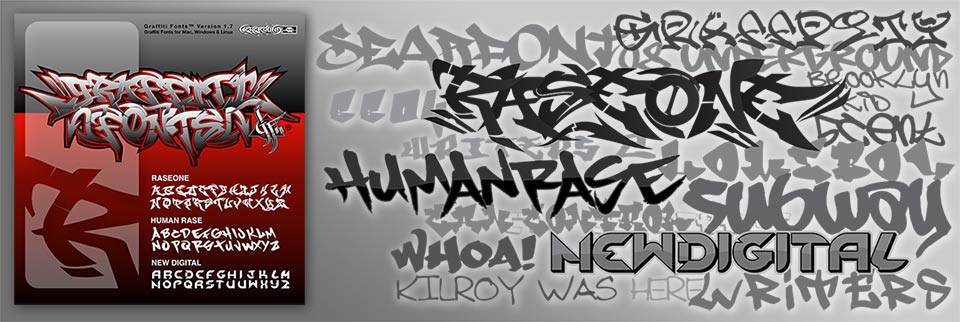
Released 04/08/1999, the 1st official typeface from the Graffiti Fonts® foundry, the 1st wildstyle graffiti font & only the second graffiti style typeface ever designed by a writer.

Human Rase - A Legible 90's Tag Style
1999 - Matthew (RaseOne) Napolitano - FTA - Full Time Artists Crew - U.S.A.
Released on 06/09/1999. The second official release from the Graffiti Fonts® foundry. Designed by a writer with a full compliment of 256 characters.
1999 - Graffiti Fonts® Type Foundry Established
With a few completed fonts & CDROMs & webpages in the works the Graffiti Fonts® type foundry was first established in mid 1999. An initial set of 3 fonts was completed & previewed on fulltimeartists.com, The home page of the south bay based FTA (Full Time Artists®) crew. The new foundry was placed under the umbrella of a small company called Highground™, formed by members of FTA, SFSM (San Francisco Street Music) & others which at the time functioned mainly as a manufacturer & label for independent, underground Hip-Hop music.

Tagster - A Solid, Early Tag Style
1999 - ryz/SD
Released 10/14/1999, Tagster is a rough, chisel-tip tag style with a teardrop letter style & backslant characteristic of graffiti, made via vector auto-trace.

Tags X Treme 1 & 2
1999 - Pizza Dude, Jakob Fischer
Released 08/28/1999, these fonts saw a lot of use, in part due to the prominence of Pizza Dude as a font designer.
RaseOne - A Layered, Wildstyle Type Family
2000 - Matthew (RaseOne) Napolitano - FTA - Full Time Artists Crew
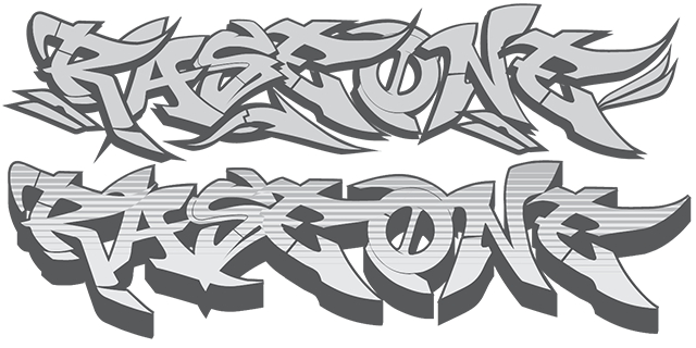
Released on 02/21/2000 by the Graffiti Fonts® type foundry. With 4 interacting styles, this font holds the distinction of being the first layered type system in the graffiti genre. This set was an expansion of the original RaseOne font.

Def Artist / Def Writer - A Stackable, Layered Graffiti Type System
2000 - Chuck Davis (Siner), Letterhead Fonts® - Def Artists Crew
Released 08/14/2000, A layered type system, designed by the inventor of the layered type system who was also an actual graffiti writer. One of the most obscure graffiti fonts.

Degrassi - A Simple Piece Style
2001 - Ray Larabie, Larabie Fonts™
Released on 01/08/2001, this font is an outline style designed to resemble a simple piece. The capital letters include an arrow flourish.

Fatcap - A Layered, Graffiti "Stamp" Style
2001 - Matthew (RaseOne) Napolitano, FTA - Full Time Artists Crew
Released on 09/06/2001 by the Graffiti Fonts® type foundry, includes an outline style, fill style, a repeatable cloud background & cap & can digngbats.

Pilot Rase - A Chisel-Tip Marker, Tag Style
2002 Matthew (RaseOne) Napolitano - FTA - Full Time Artists Crew
Released on 01/16/2002 by the Graffiti Fonts® type foundry, includes 2 full alphabets, alternate letters & flourishes.

Writers - Another of the earliest tag fonts
2002 - Johan Waldenstrom
Released on 04/08/2002, this chisel-tip style was the first from Johan's set of graffiti fonts which helped launch the genre with tag & throw styles.

Subway - A Popular, Early Tag Style Graffiti Font
2002 - Johan Waldenstrom Released on 04/08/2002, With a single alphabet, numbers & a few symbols, Subway would become one of the more widely used, early fonts in the genre.

5 Cent
2002 - Johan Waldenstrom Released on 04/08/2002, Despite offering only 26 letters, this font added to the still very small array of fonts undeniably built to emulate graffiti handstyles & to this artists sizable contribution to the early genre.

Bomr
2002 Ray Larabie - Typodermic™
Released on 04/19/2002, this angular style was meant to emulate a throw-up or stamp style. The font featured a robust character set & a unique letter style.
2002 - The Debut of GraffitiFonts.com
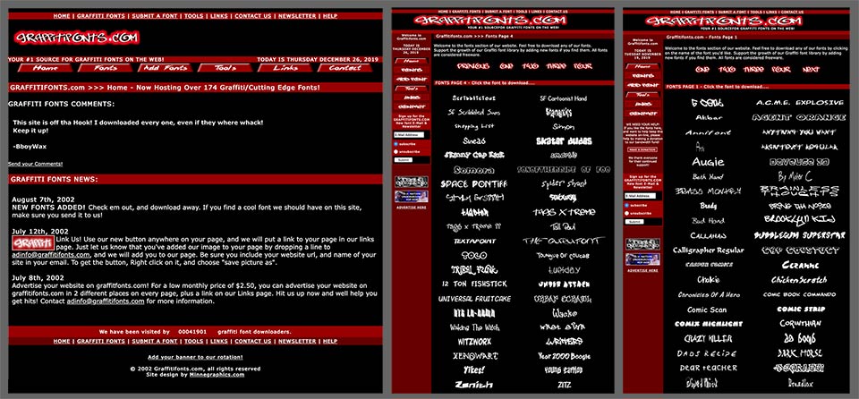
The graffitifonts.com website first went online in 2002 but only a tiny fraction of the featured typefaces on the site were actual graffiti style fonts.
On June 3rd 2002, with the debut of graffitifonts.com the first website dedicated entirely to graffiti style typefaces emerges. With less than a dozen real graffiti styles in existence & only a handful of those fonts included, the site is largely populated by graffiti-ish fonts that could be used to loosely emulate graff styles. Several of the early graffiti style tytpefaces listed in this timeline were included. Seemingly, permantently stuck as the #1 search result, this site would survive & evolve for about a decade. It was taken over by the Graffiti Fonts® type foundry in 2007 but left largely unchanged until 2012, when it was merged with the foundry's home site, formerly found at graffitifonts.net.
2003 - graffitifonts.net goes online
Preparing to launch the first official CDROM collection the Graffiti Fonts® foundry launches a dedicated site. Beginning 09/13/2003, With the .com taken, the collection is previewed on the .net domain before the release. While the foundry had started up in 1999 & their first several fonts were first published on fulltimeartists.com, the launch of this site marked the first wide-scale release of the collection.

This array of screenshots shows pages from the very first version of the graffitifonts.net website which debuted in 2003. The initial site was only about 8 pages, entirely built in Flash® & came online months ahead of the release of the original Graffiti Fonts® CDROM collection.
This small, preview version of the website would stay in place for about a year, untill the release of the Graffiti Fonts® 2.0 CDROM collection in 2004. The Flash site would give way to a graphics-heavy html design that could better accomodate the larger volume of more rapidly changing content the foundry was creating & gathering.
2003 - Graffiti Fonts® 1.0 CDROM
2003 - Official Release of Graffiti Fonts® 1.0 CDROM Collection
Early versions of a CDROM collection from the Graffiti Fonts® foundry were created dating back to the year 2000 which included the foundries early fonts along with design templates & website assets & other digital items but in 2003 a more focused product was developed that included 3 of the foundries first fonts along with a selection of graffiti fonts from other pioneering developers. The first versions of this collection contained only 13 fonts & sold for the same $40 retail price as the stand-alone RaseOne® font. Many fonts were at first omitted to keep the price low & test the market for a CDROM collection. At this point The foundry filed for the first trademark on the brand name "Graffiti Fonts". This CDROM was the first collection of graffiti fonts in the form of a physical product.
Over the years since the initial release, fonts were updated to the most recent version but new fonts were never added. Instead, new versions of the collection with larger & larger selections of fonts & other assets were created. The Graffiti Fonts® ver. 1 collection is still available here in our Collections section, in both CDROM and digitial download formats.
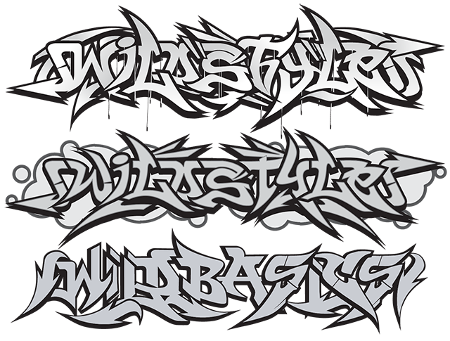
WildStyle™
2003 Matthew (RaseOne) Napolitano - Graffiti Fonts
First completed in late 2003 by Matthew (RaseOne) Napolitano for the Graffiti Fonts® type foundry, the WildStlye font family replaced the RaseOne family as the most advanced wildstyle font available. Glyphs from this layered system of 5 fonts connected & interlocked more like an actual wildstyle. End pieces, flourishes, alternate glyphs, spray can & cap digngbats, a repeating cloud background & OpenType features helped set a new baseline for the translation of the graffiti wildstyle into type. Nearly a decade later, this font will be chosen to represent the impact of graffiti style typefaces on modern graphic design in the Yale University textbook "Graphic Design A New History".

Scrawler
2003 Matthew (RaseOne) Napolitano - Graffiti Fonts
Designed in late 2003 by RaseOne & not released until the GF3 collection in 2005 the Scrawler font is a wild, tag style with a large character set.

Homeboy
2004 - Johan Waldenstrom
First released on 02/06/2004, Homeboy is arguably the first true graffiti throwie style typeface ever designed. The font had a limited glyph set but stayed very true to the stylistic form of traditional throwies. Being a writer himself, Johan brought a number of authentic styles to the table early in the game.

B-Boy
2004 - Johan Waldenstrom
Released on 02/06/2004 - B-Boy is another throw or stamp style faithfully emulating styles often found in association with B-Boy or breakdance culture, a definitive subset of the overarching Hip-Hop culture that encompassed much of graffiti art throughout the decades.

Writers 2 & 3
2004 - Johan Waldenstrom
Released on - 02/06/2004, these and other additions to the "Writers" set would bring the family up to a total of 5 styles, making it one of only a few graffiti fonts to offer a multi-part set & one of only two to reach 5 styles.

Funboy
2004 - Ray Larabie, Typodermic™ Released on 07/08/2004, Funboy was a well crafted & very legible, tag inspired font with a large character set.

Menace - A Finely Crafted, Layered (Stackable) Graffiti Type Set
2004 - Chuck Davis (Siner), Letterhead Fonts®, Def Artists Crew
Released on 10/15/2004, Somewhat a reborn iteration of Def Artist / Def Writer. Could emulate either a simple piece or a written form, includes full base fill layer & a bevel overlay. This font omitted the outline & 3D styles that were included in the earlier Def Artist / Def Writer set & was built partially in response to an offer From the Graffiti Fonts® foundry to include Def Artists & Def Writer the foundry's CDROM collections. Despite the historic nature of the earlier sets Mr. Davis had discontinued them & instead issued Menace as a replacement.
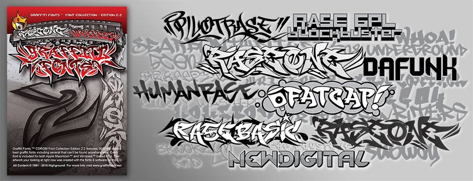
The Graffiti Fonts® 2 collection was released in late 2004, featuring an exapnded collection of graffiti fonts & presented in DVD style packaging.
2004 - Release of the Graffiti Fonts® 2.0 collection
In late 2004 the 2nd edition of the Graffiti Fonts® collection was released. This expanded version of the collection included more of the fourndy's exclusive fonts, including the full RaseOne layered family & a larger selectiuon of fonts from other artists. Like it's predecessor, this collection came very close to offering every graffiti style typeface on earth but, to keep the cost down, some of the more recent fonts from the foundry were omitted and some 3rd party fonts were not included. This 2nd collection sold for $100 in DVD style packaging, with a printed instruction booklet.
By this point the number of published typefaces in this genre is still just a few dozen. Monotype extended an invitation to the Graffiti Fonts® foundry to distribute the CDROM collections & the individual typefaces but did not yet have a category for graffiti. The graffitifonts.com & .net websites were starting to draw substantial traffic & more authentic graffiti typefaces were starting to appear in larger scale commercial design where before one would often have seen faux graffiti, usually rendered by non-writer graphic designers. These fonts were also seeing frequent use within the Hip-Hop community from underground to commercial projects, showing up on fliers, album covers, in magazines & on clothing. Made easy by the research & curative work of the .com & .net websites, wide spread piracy began to set in, increasing the distribution of the fonts exponentially & driving the popularity of the whole genre far beyond the underground Hip-Hop circles where it first began.
The Graffiti Fonts® ver. 2 collection is still available here in our Collections section, in both CDROM and digitial download formats.
The Proliferation - 2005 - 2010
Ten years after the first graffiti typefaces appeared, circa 2005, more organized efforts to cover the bases had been at work for years. The work of representing the many types & sub-types of graffiti lettering had produced a fairly comprehensive selection of tags, pieces, throws, blocks & gangster styles. The notion that these styles would entirely defy translation to type was being proven wrong. The collaboration of many graffiti artists to create these fonts, and the enthusiasm with which they were used by the very critical Hip-Hop community had embued them with sufficient street cred & technical quality to maintain forward momentum. Based on this strong start, moving forward, even more serious efforts were untertaken.
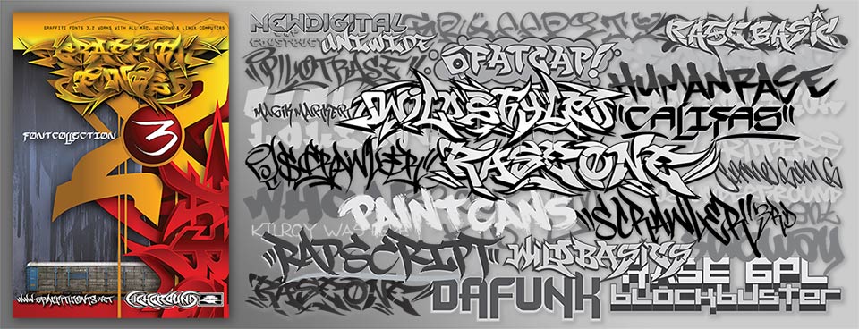
The Graffiti Fonts® 3 collection was released in 2005. This edition included a far larger selection of fonts from a broader array of artists & also included stock images, vector art & open source software.
2005 - Release of the Graffiti Fonts® 3.0 Collection
With the release of the the 2nd & 3rd Graffiti Fonts® collections & expansion of the still separate graffitifonts.net & graffitifonts.com web sites, the worlds catalog of authentic graffiti fonts was begininng to increase rapidly. With many new designs released & more fonts lifted from relative obscurity these collections & the associated websites achieved significant notoriety & mainstream usage which helped bring much greater attention to the emerging genre as a whole. From here we would start to see a wider development of graffiti typefaces from a larger number of artists & foundries. In the following years font download websites & font distributors would gradually begin to add graffiti categories to their offering where no such category had existed before but at this early stage it had fallen mainly into the hands of graffiti writers & devotees of underground Hip-Hop culture themselves to crowbar graffiti lettering into the relm of digital type. With almost nowhere else to look, virtually every graffiti style font ever created resided on one or both of the competing graffitifonts.net & graffitifonts.com sites.
The Graffiti Fonts® ver. 3 collection is still available here in our Collections section, in both CDROM and digitial download formats.
graffitifonts.net - circa 2005 - 2010

The graffitifonts.net website grew & expanded rapidly, eventually attracting about 2,500 daily visitors between 2004 & 2011. The site offered a combination of free downloads & commercial licensing & was for a time the only place to get the full Graffiti Fonts® collections that were offered on on CDROM & DVDROM. This array of screenshots shows pages from the site that were live between 2005 & 2010.
Even with a decidedly more advanced collection of typefaces & a decidely larger & more robust offering, graffitifonts.net never did overtake the .com site in search. The .com worked on an ad-supported, free content model. The expensive, commercial collection had a hard time overcoming the attraction of free stuff. An arrangement was struck for the .com site to become a reseller of the Graffiti Fonts® CDROM collections. The .com had previously run entirely on an advertising model, distributing freeware fonts & featured only a small handfull of actual, authentic graffiti styles. At it's peak, the .com offered about 350 freeware fonts. At the time, to my very critical eye, only a dozen or so looked like they been created with the intention to emulate modern graffiti lettering. To my idealistic, younger self, this was some sort of a travesty. The addition of the official "Graffiti Fonts®" collections was the first step towards the eventual takeover of the .com site by the Graffiti Fonts® foundry that would occur a few years later. In the meantime, with greater revenue & more content, the .com would grow in size & sophistication partly due to the featuring of content from the .net site & partly due to a robust community forum/gallery populated with user generated content but mostly due to the continued growth in interest for fonts in this genre. Mirroring the broader font industry, two, nearly opposite business models were in play and both were working. The ad-supported, freeware model was easier, making more money and spreading more fonts to more people but the commercial, rarity-based model was producing much finer workmanship & authenticty.
graffitifonts.com - circa 2005 - 2010

The graffitifonts.com website was launched earlier than the .net but was not a font foundry, instead offering a selection of freeware fonts that resembled graffiti. Only a small portion of the fonts were intentionally made to emulate modern graffiti lettering. Operating on an advertising based, freeware model, this site would attract as many as 10,000 daily users & would eventually be taken over by the Graffiti Fonts® foundry. These screenshots show pages that were live between 2005 & 2010.
While the .net site was never able to win the search battle (at least not on Google), it did eventually win the actual war. In 2007 The Graffiti Fonts® foundry bought the site & domain from it's creator & took over operation. Over time, the user generated content in the forum/gallery was removed & the system disabled. A questionable pop-up advertising system was disabled & content that originated from the .net site was removed to elimiate duplication. The sanitized & stabilized version of the site was basically left alone while a merging of the two sites was developed behind the scenes. The two sites were eventually merged a few years later.
Trends, Distribution & Piracy - circa 2007 - 2009
Around this same time, the Graffiti Fonts® foundry began distributing a larger number of their fonts through Monotype (fonts.com & myfonts.com) & "graffiti" categories were begininng to appear on the multitude free font download sites, helping to bring additional fonts to the surface & further inspire more type designers & graffiti artists to contribute the the growing genre. With a substantial & growing crop of actual graffiti styles available & an ever-increasing level of technical quality, the genre was enjoying a lot of attention. "Graffiti" had become a viable category for commercial font distributors and download sites. Most were very, very loose with their definition of graffiti & the few dozen legitimate graffiti styles that existed would usually be mixed in with dozens or even hundereds of random grunge, script, stencil & tattoo style fonts. Section 6 of this article provides an in-depth exploration into the difficult task of defining a graffiti genre within type.
While not all were guilty, piracy was rampant amongst the free download & torrent sites. Once rare typefaces that were only available through selective, commercial licensing were spread around the world as tens of millions of illegitimate copies were distributed. Ironically this art form that was born illegal, would struggle against theft & infringement in nearly every legitimate, legal venue it entered into. Type was no exception.
For the general public, the destructive elements of graffiti had always outweighed any merrit that the art had to offer. Since "real" graffiti is so often out in public, since it's often criminal, since it's often seen as just blight and decay, there was no particular requirement in law, no incentive in polite society to respect the intelectual property. Graffiti Artists had, throughout the history of the art form seen their work used commercially without permission, immitated & bastardized in endless ways... but the general sense was that this "came with the territory". Digital typefaces are software & in software, piracy comes with the territory. Some writers / type developers responded by going along with the inevitable & using their fonts as free promotion, placing them on every available site & allowing the piracy to progress full-steam. Largely because the big tech companies with their advertising platforms etc. would be the main benficiaries of the artists work, others fought against it, controlling licensing even more strictly & retaining even more exclusivity over their creations. Still others would deploy a mixed strategy in an attempt to benefit from both models. For example, this chaotic situation was one of the driving forces behind the painstaking, covert creation of the 4th Graffiti Fonts® collection. With so much of our existing material (any everyone elses) flowing freely through the internet we chose to develop a whole new crop of material that nobody had.
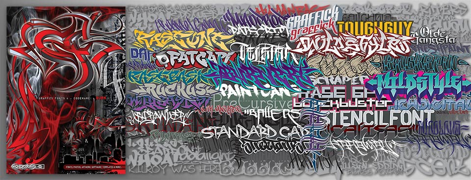
The Graffiti Fonts® 4 collection was released in 2009. Starting completely from scratch, this all new collection boasted 100 graffiti fonts as well 800 other items from stock images & vector clip-art to templates & photo cut-outs.
Graffiti Fonts® 4.0 Codename: BURN - 2009
In 2009, after working for 4 solid years, the Graffiti Fonts® type foundry released a secret project that had been in the works since 2005. Graffiti Fonts 4.0 - Codename: BURN was an entirely new collection that had been kept entirely under wraps while in development. With the existing crop of graffiti fonts losing their rarity via piracy, this collection would offer entirely new material that could once again be scarce & uncommon. While the first 3 collections were released on a roughly, yearly schedule & were cumulative in nature, this 4th edition had taken much longer to create. It boasted a collection of brand new graffiti fonts larger in number than the entire library of such fonts ever designed. With 50 new commercial faces & 50 free faces not included in the previous collections, the release of BURN basically doubled the world's supply of graffiti fonts. The typefaces developed for this collection filled in many of the missing stylistic spaces that existed in graffiti style type, covering somewhat more hardcore & modern styles & focusing less on traditional & old school styles. This edition also focused a bit more on wider usability, namely legibility, larger, more traditional character sets, finer technical quality & expanded families.
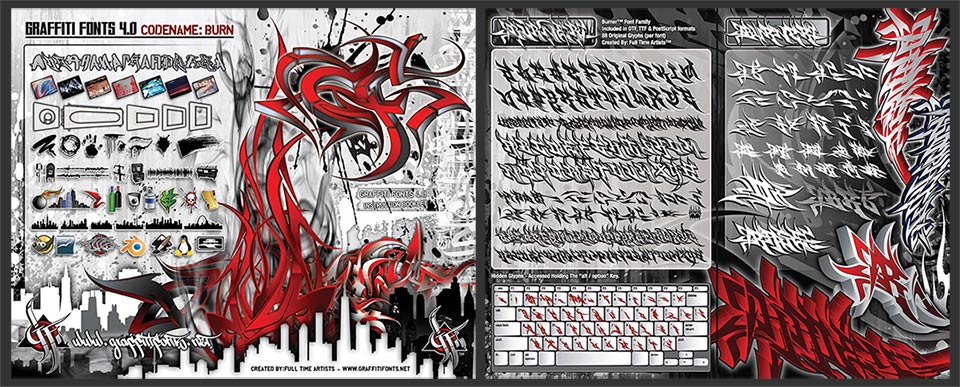
front/back cover graphic & centerfold showing the Burner™ font family from the Graffiti Fonts® 4 instruction booklet.
While price had been a major concern & limiting factor in the design of the first 3 collections, this 4th edition was intended for serious design professionals & initially sold for $600. It would continue as a stand-alone collection for several years untill it was merged with the contents of the earlier collections in 2016. Lower end & less authentic, mostly freeware fonts were bumped to keep the total number of font families stable at 100. This collection is still available today. New fonts & updates to existing families continue to be added. The most recent versions include more firsts, including the first color SVG fonts in the graffiti genre & the first graffiti fonts to make use of advanced OpenType scripting to more acurately emulate the very organic lettering styles of hand written & hand drawn graffiti, the first graffiti fonts to type in a verticle direction rather than horizontal & the first layered sets for throwie styles and the first variable graffiti style fonts. The original 3 collections are updated to include the latest versions of all included fonts, contemorary to the time of release but this 4th edition continues to have entirely new fonts added as they become available. A 5th edition may someday be released but the number of graffiti fonts now in existence makes it impracticle & cost prohibitive to continue trying to feature nearly every font in the world as the first three collections did.
The Graffiti Fonts® ver. 4 collection is still available here in our Collections section, in both CDROM and digitial download formats.
This brings us into 2010, by which time, a graffiti genre was well established within digital type. While still small in numbers & rare compared to fonts in other, more established categories, well over 100 graffiti style typefaces had been published. Websites & collections dedicated entirely to the genre had been produced. While still a niche market, the popularity & usage of such fonts had become reasonably mainstream. As graffiti in previous years & decades had broken in to poular culture & fine art, it had now established itself within the circles of commercial design & type. With one foot still firmly rooted in its street-level roots, including Hip-Hop culture, by continuing to break new ground & push into new territory over 40 years after it's birth the art form had continued to assert it's versatility & staying power.

